Master Mobile Optimization: Best Practices to Boost Your Website's Performance
- December 30, 2024
- SEO
The world is rapidly moving towards technology and innovation and people are becoming tech-savvy and the biggest role in this change is played by mobile and the internet.
Around 58% of global internet traffic will be driven by mobile devices in 2023, making mobile optimization an essential strategy for website owners.
Irrespective of who you are from a business owner irrespective of online or offline to a blogger, understanding how to optimize your website for mobile devices can help you build a loyal client base.
Now that you have reached this guide, our job is to help you understand everything about mobile optimization to increase user experience and help you master mobile marketing in the digital world.
Why Mobile Optimization Matters

Don’t just jump on “How”, first understand “why” mobile optimization for websites is essential in modern times.
Mobile Usage is Exploding
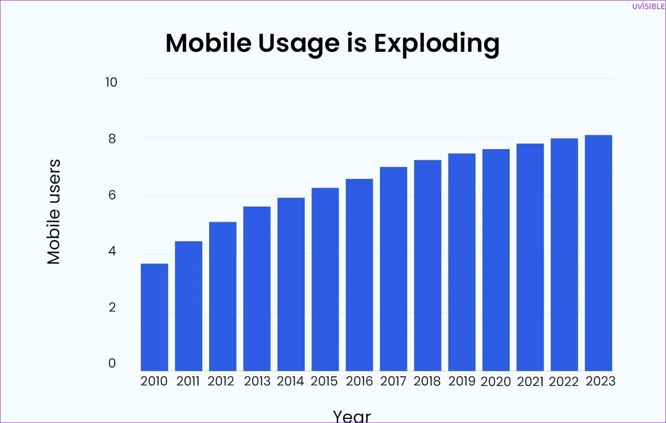
The number one reason we could find was the growing usage of mobile devices to access the internet.
Studies have suggested that 92.3% of internet users go online via their mobile phones. People are inclined towards phones to search, shop, and pay.
If you lack at optimizing your website for mobile devices, you are definitely going to lose a chunk of potential customers.
Search Engine Preference
Search engines especially Google have mobile-first indexing prioritizing the mobile versions of a site over others while ranking pages.
This makes mobile optimization one of the essential KPIs for SEO success and helps to get high rankings in search engines.
Enhanced User Experience

If you lack a user experience, you might lose 88% of users to revisit your site or buy from you after a bad mobile experience.
We are sure that you don’t want that, and that’s how mobile optimization comes in handy to create a seamless experience to reduce bounce rates and increase engagement, and conversions.
Key Best Practices for Mobile Optimization
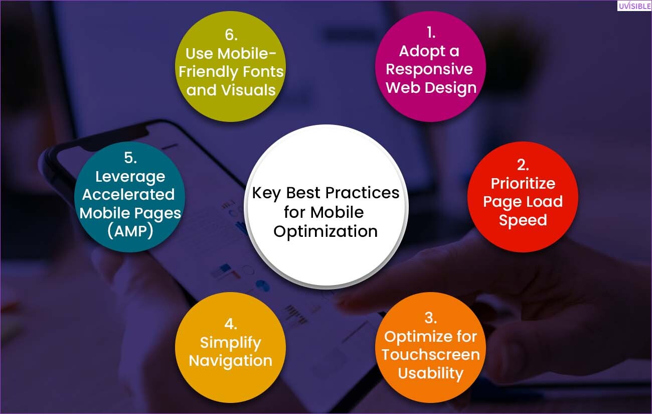
What best practices you should follow to optimize your website for mobile devices:
1. Adopt a Responsive Web Design
- The prime practice to implement for mobile optimization is to adopt a responsive web design.
- This way you will be able to ensure that your website is ready for different screen sizes and resolutions.
- This way you don’t have to build two different strategies for desktop and mobile sites.

For example,
Amazon’s responsive web design provides a seamless experience to users across all the devices leading to high mobile conversion rates.
Tip of the Day
You can use Google’s Mobile-Friendly Test tool to check responsiveness and to create adaptable layouts, using CSS media queries.
If you're considering professional help, engaging with website design services can make this process smoother and more effective.
2. Prioritize Page Load Speed
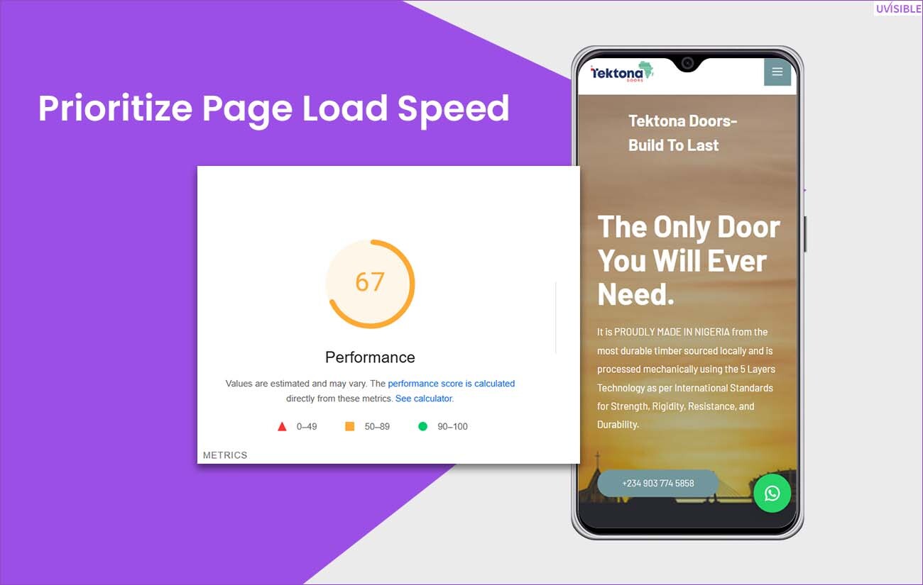
Slow-loading pages are a slow poison for your website that draws users' attention and kills your SEO strategy.
Google suggested that a 1-second delay in mobile load speed can cost 20% conversion rates by 20%.
Tips to Improve Load Speed:
- Optimize images for the best image size for mobile phone's website speed.
- Include next-gen formats like WebP.
- Utilize Content Delivery Networks (CDNs) and browser cache.
3. Optimize for Touchscreen Usability

Mobile devices are touchscreen and they require features like links, buttons, and forms that are tappable, unlike desktops.
Tips Optimize for Touchscreen Usability:
- The ideal touch target size is 48*48 pixels.
- Clickable elements should not be placed close to each other. Ensure proper spacing.
- Simple forms and autofill suggestions work best.
4. Simplify Navigation

Remove complexity from the web menus for quick and intuitive navigation for mobile users. Complex menus can increase bounce rates.
Best Practices to Simplify Navigation:
- Hamburger menus are best to save screen space.
- Sticky navigation for important links throughout the page.
- Improve search functionality with autocomplete features.
5. Leverage Accelerated Mobile Pages (AMP)

AMP is an open-source platform that delivers fast-loading, lightweight web pages to enhance mobile browsing.
Benefits:
- It will reduce page load time.
- AMP lightning bolt icon provides higher visibility in SERP.
6. Use Mobile-Friendly Fonts and Visuals
Readability and appealing visuals are keys to hooking your audience on your website, especially when offering SEO services.
So be sure to use readable fonts and high-quality visuals for a smooth mobile experience.
Typography:
Common fonts to use are Arial or Times New Roman and the ideal font size is at least 14px.
Visual Content:
High-quality images with optimization are essential. Optimize them for smaller screens.
Enhancing Search Engine Optimization for Mobile
Create an SEO strategy around mobile optimization, focusing on building SEO-friendly websites to boost online visibility and enhance your digital performance.
Mobile-First Indexing
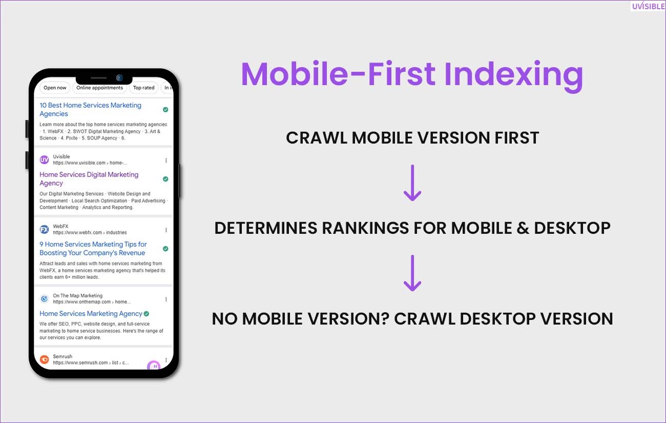
Google favors mobile devices, making it essential for your website to ensure a high-quality mobile version your website.
Steps to Optimize:
Let search engines understand your content through structured data.
Optimize Meta Tags for Mobile

Mobile SEO requires precise and compelling meta titles and descriptions to improve CTR.
For example, an online baby product site should use “Doctor-certified baby products- free shipping!” rather than a generic title.
Use Mobile-Specific Keywords
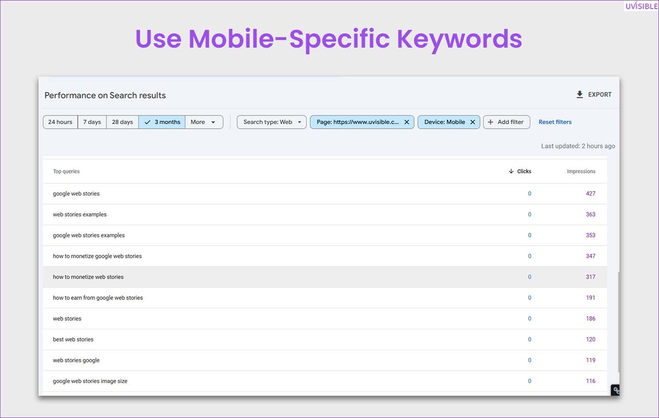
Search behavior is different on different devices. For mobile optimization ensure mobile-related keywords that are intent-specific and conversational in nature.
Generally, long-tail keywords that are localized in nature perform well. Like “How to monetize Google webstories” and “monetize Google webstories for SEO” in your content.
Tools to Measure Mobile Optimization
To measure mobile optimization, you can use the following SEO tools for regular testing and maintenance:
Google’s Mobile-Friendly Test:
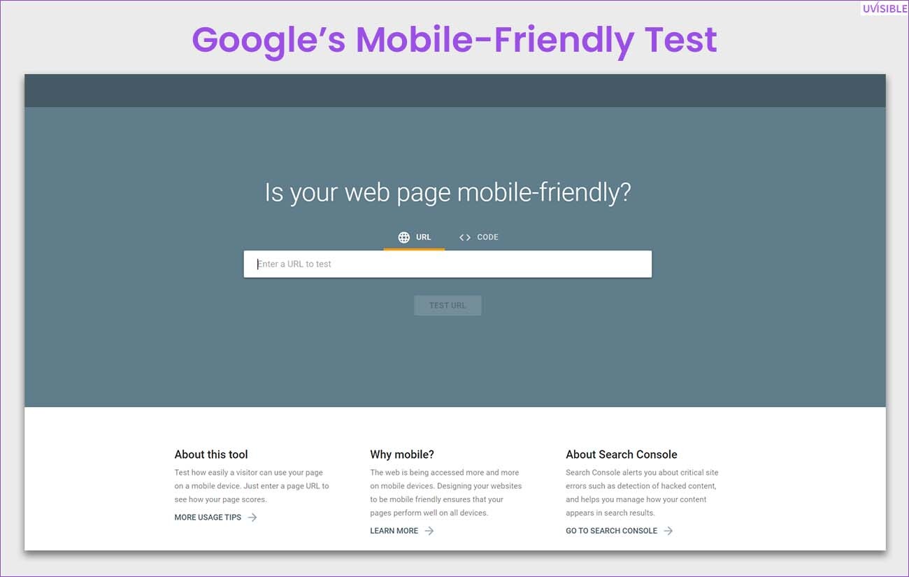
Test the website on Google’s parameters to see if it complies with usability standards.
PageSpeed Insights:
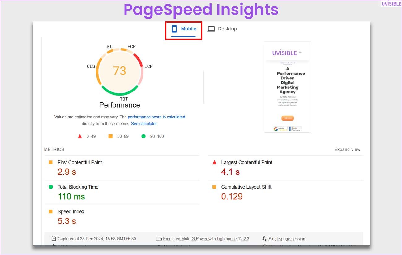
This provides suggestions for improving page load speed and improvement.
BrowserStack:
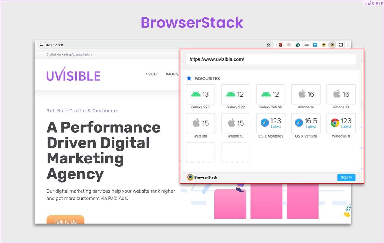
Check how your site is performing on different devices and browsers.
Google Analytics:
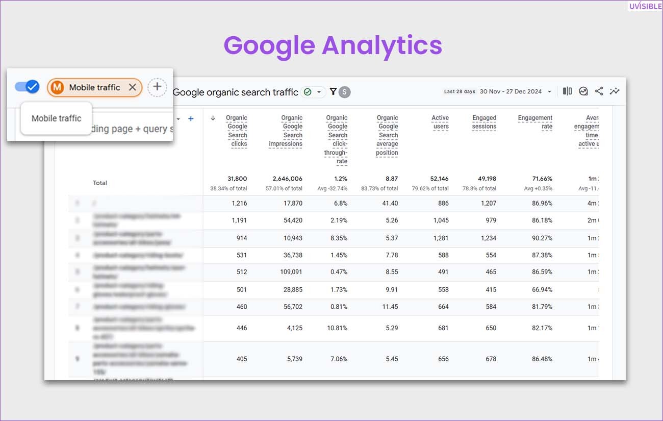
The best way to analyze mobile traffic and areas for improvement.
The Future of Mobile Optimization
With growing technology and an increase in the number of mobile users, the need for mobile optimization will grow further.
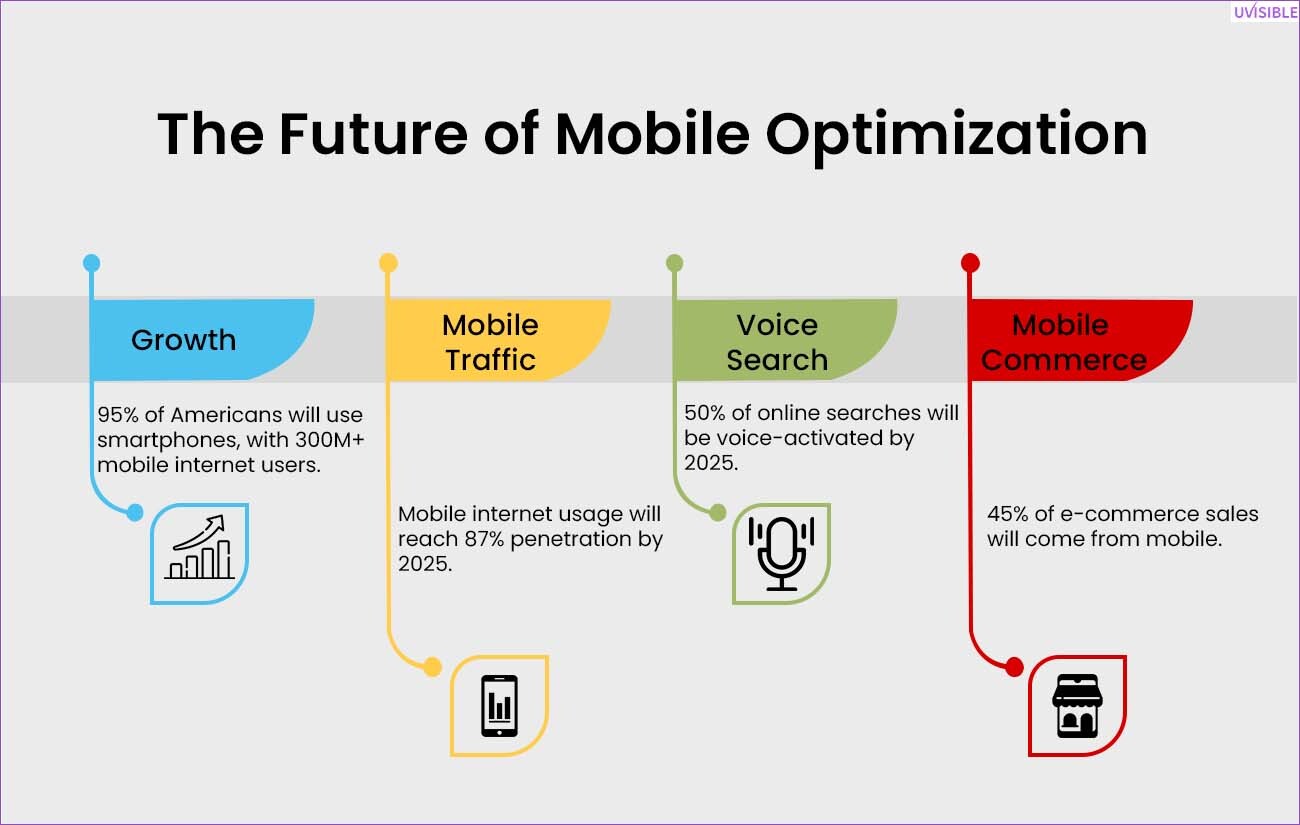
Utilize trends like voice search, progressive web apps (PWAs), and 5G connectivity for better optimization of your website for mobile devices.
If you incorporate these trends with your mobile optimization, you will get to be ahead of the competition and get the attention of the target audience.
Conclusion
A mobile-optimized website is essential for today’s competitive age.
If you focus on fast loading speed, responsive design, and mobile SEO—or even choose to outsource SEO—, you will get a website that provides a seamless experience and ranks well on search engines.
Irrespective if you just beginning to learn how to optimize the site for mobile or trying to improve the existing strategy, these tips will help you get the best for your website’s performance.
Don’t forget, a mobile-friendly website is not something to be delayed but is a quick-shot strategy to thrive in a mobile-first world.
About us and this blog
We are a digital marketing company with a focus on helping our customers achieve great results across several key areas.
Request a free quote
We offer professional SEO services that help websites increase their organic search score drastically in order to compete for the highest rankings even when it comes to highly competitive keywords.
Subscribe to our newsletter!
More from our blog
See all posts


")
Recent Posts
- Zero-Click Searches: How to Still Get Traffic in 2026 June 29, 2026
- WordPress SEO Mistakes That Hurt Rankings June 15, 2026
- E-commerce SEO Audit Checklist for Shopify Stores June 1, 2026
Pingback: Technical SEO Audit Checklist: Step-by-Step Guide with Tools
Pingback: Best SEO Tools to Track Rankings and Performance
Pingback: Turn Clicks Into Cash: 6 Web Design Hacks to Boost Sales!
Pingback: Overcoming Real Estate SEO Challenges: A Winning Strategy for Agents and Brokers
Pingback: Dominate Search Rankings: Powerful SEO Tips for Home Improvement Businesses!
Pingback: Ultimate Guide to Local SEO for Plumbers: Tips, Strategies, and Best Practices
Pingback: Unlocking HVAC SEO Success: 4 Pillars to Dominate Search Rankings
Pingback: Grow Your Plumbing Business Online: Plumbing Marketing Master Tips - Uvisible
Pingback: Mastering Call-to-Actions: Proven Strategies to Boost Your Conversions